[3d Modeling] Let's Talk Aboiut Failure (Team Instinct 8oz Mug)
 |
| Team Instinct Mug, but what's wrong? |
Learning About Failure
I've written a lot about the positive side effects of failure in other posts, especially in regards to some of the video education stuff that I've done. (If you're interested in specifically the Collection regarding video education, you can find that over here: https://plus.google.com/collection/wBTgQB.)
This is a short version:
Success doesn't teach us anything. Success is the flag which tells us that we have finally achieved what we were aiming at; it's an end flag. End flags are important because they signal us that we should finally have that shot of serotonin that creates the reinforcement of seeking success. But that neurochemical signal is as much a punishment/signal flag of failure when we don't get it and have come to accept it.
Some of said that failure is what you get when you don't get what you want. Others have said that's experience. They're both true. Success creates the condition for the psychological addiction to getting things done properly – which is a good addiction to have. Failure creates the condition for you to learn what you've done wrong and creates a chemical motivation due to the absence of pleasure responses in your brain. Recognizing failure primes you to learn because to seek reward and pleasure is a good thing.
(One day I need to write a very long article on my suspicion that the ongoing "War on Drugs" and other modern world neo-Puritan social changes have created an environment in which the natural cognitive processes built around success as chemically rewarded and failure as pleasure-starvation have become derailed, leading to the terrifying number of people who simply don't seem to be able to link success with pleasure and failure with the lack of it, but that day is not today.)
It behooves all of us as creators and self-aware people to stay on top of understanding that failure, while not chemically rewarded, is the moment at which we can learn. Education can only take place once ignorance is not only acknowledged but demonstrated. Without manifest failure, you simply cannot learn. Education can occur without failure. You can certainly observe other people and their failures, make note, and take guidance from it – and that can lead to immediate successes just as can luck. But those things aren't practical learning.
If you really want to get good at something, if you want to get that frequent hit of success, you need to do a lot of things like the success you want so that you can fail enough times to learn how to do it right. Consistently. That simply won't happen without the repeated experience of failure that teaches you what not to do and prepares you for that natural chemical high of getting it just so.
So let's talk about my recent project failure and how I believe I've learned from those failures to make something better in almost every way.
Ideation
 |
| Pokeball Mug |
A week or so ago I'd just finished designing a fairly nice 12-ounce mug intended to be done in ceramic with a Pokeball theme – literally with a big hollow Pokeball attached to the front opposite the handle with a physical design completely intended to leave that ball hollow in order to provide for better balance. Ultimately I was pretty happy with the results.
If I object to anything in this original, it's that my understanding of how to design the handle of the mug needs more experimentation. I got the general shape I was looking for, thicker in the middle and close to parallel with the tabletop where it joins the mug body proper, but it's not exactly what I wanted. And that's okay.
This was intentionally, originally, thought of as largely a technical piece, intended to really experiment with the idea of deliberate shifting of the center of gravity within the space of the mug in unexpected ways with the design. A hollow ball that is attached to the front of the cup, counterbalanced by a heavier handle (though lighter than expected because the ball itself is hollow), and taking into account the mass of the fluid that will eventually go into the mug, one hopes, is a pretty bold thing to attempt if you're looking for a challenge. This actually turned out pretty well.
Notably, this design ignores that I've been making things with clear Pokémon Go team affiliation logos. Team identification is important to a lot of people and I have done a fair number of designs in the past, from my challenge coins to the medallions, which showcase and allow people to display that affiliation. I think they're pretty interesting pieces in their own right and I wanted to continue along that path to the new design. And since I, myself, am Team Instinct, I generally want to start with that particular logo.New video by Alexander Williams
The fact that the logo is straightforward, mostly straight lines, and one of the easiest to design around has nothing to do with it, I promise. Okay, maybe a little bit to do with it.
That was the idea. Make a Team Instinct mug that could join my other pieces on Shapeways and elsewhere.
Things Go Sideways
Nothing is ever as straightforwardly as you expect.
Porcelain Ceramic 3D Printing Material Information - Shapeways
Learn everything about 3D printing Porcelain Ceramic: tips, design rules, technical documentation, and product examples and inspiration.
Except for the fact that Team Instinct is very aggressively a bright yellow color icon. Annoying, but I can accept the fact that Instinct will have to deal with being gloss white in actual manufacture. In my design work, I can always tinker with setting some faces to a paint color purely for highlight purposes. It's not that big a deal, just an annoyance.
More serious was the problem that I ran into in the process of modeling a handle for the mug. My original intent was for the entirety of the mug to have a little bit of an indent on the inside where the handle connects to maintain a steady and consistent wall thickness throughout the piece, and with a very simple handle design that works just fine in Fusion 360. It works somewhat less fine in Onshape, possibly because of a bug with complex shelling, possibly just because it's a hard problem, but regardless both Fusion and Onshape had problems dealing with a handle constructed from a set of three lofts of different profiles. Both of them failed when trying to effectively figure out what a wall thickness going through the handle would be, even though the bulk of it was simply too narrow to be hollowed out, anyway.
That's an actual failure, and from that I learned that there are certain procedural volumes which, even though Boolean logic would suggest are easily handled as part of a larger body, reality says otherwise. This is learning.
This is where I also learned that Onshape can't do lofts with a centerline to the profiles as a guideline; it can only use a line which runs along the edge of all the profiles in question. That was extremely annoying and encouraged me to decide that this project needed to be migrated to be done fully in Fusion 360, despite the fact that I really prefer are the interface in Onshape.
Eventually, though, I got that working and the shape that I liked for the handle, affixed to the team badge to the front of the mug, decided to try to attach it as one solid block which I would then hollow out into the cup body like the original Pokeball idea, and then I discovered that wasn't going to work too well either – for the same reason that letting the system create an automatic shell of 7 mm thickness didn't work with the handle. The team badging simply had too many tight nooks and crannies for the system to be able to properly determine an inner shell for it.
Well, that was fine, too. At that point, what I really wanted was to just get the design pulled together so that I could generate an STL or OBJ and get it up onto a printing site so I could find out how much it would cost, how much it would weigh, all the good things that you think about when manufacturing for actual sale.
While I was going through my internal checklist for figuring out all the what's and wherefore's, I ended up fixating on this:
 |
| What is it? |
 |
| Oh dear Hell. |
Now it's pretty obvious.
You would think that such a thing would be incredibly obvious while you're putting something like this together. After all, I had all the measurements, all the offsets, all the sizing, all generated procedurally – it should've been right there in front of my nose. And it was, but I was too busy looking at things from different angles to immediately pick up on what the problem was until I started really digging into the Center of Gravity numbers and wondering why things were slightly off to the front of the mug (if you're right-handed).
It's obvious now. It's obvious to you and me. Look at that badging. It is way off to the right. It's not quite as obvious from the front on view, but in the top down view it is massively, massively clear. A quick glance probably wouldn't give it away, however – and that's all I was giving it.
When you're in the late phases of a project and you find a something this bold and obvious, it's obviously a failure. This is a failed project.
Luckily for me, I'm okay with failing a project once in a while and I know that the best way for me to proceed is to stop, put it away, and then come back to it in a few days and work out what I think is worth preserving before scrapping the whole thing and starting over anew.
Deconstruct the Good
Once you put something down in order to step away from the failure and wrap your head around it, you have to be ready to go back and look at what was good about whatever it is you were working on. This is one of those hugely necessary steps in being a functional creative, the ability to look at a failure and figure out where the failure actually happened and what you can do better and differently.
Let's look at what this piece looks like.
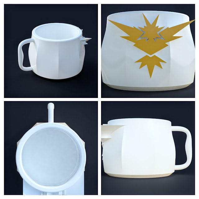 There is actually a lot to like here.
This is designed as a 12-ounce mug, and I put it together with a circular base plane which lofted to an octagonal midplane, and then a circular top plane which was slightly smaller than the base. I adjusted the chamfer at the bottom for a nice 4 mm, filleted the top a couple of millimeters on each side for easier sipping, and the main shape of that body really pleases me. It's a nice, solid piece.
The handle is actually decent. 6 mm circle profiles at the top and the bottom thicken into a 9 mm flat circle in the center. It occurred to me once I began to study this that having the handle attached purely horizontally is not ideal in terms of strength. Because of the forces and the torques that happen when you lift a mug, that's relatively weak. It could be made much stronger by simply angling the connection such that more material goes along the line of stress. Will this handle work? Absolutely. Can I do better? I believe so.
The position of the badge is simply wrong horizontally, but it has the right size and aspect for the proportions of this mug. It's bold, it's exciting, and it definitely manifests affiliation with the Team. That is a good thing to have. That needs to be maintained.
Having looked at some of the really good and nice aspects of this, what's wrong with it?
That badge is off-center. The Team Instinct logo is inherently asymmetrical. Seriously, check it out; lay down a vertical line where you think the line of symmetry should be and look to either side. It is very slightly asymmetrical. (As opposed to Team Valor's logo which is almost grossly asymmetrical.) There is no excuse for me to have placed it this far off to the right. None. That was a total screwup on my part.
Shapeways charges for glazed porcelain by the square centimeter of surface area, not by the cubic centimeter of volume as they do for the rest of their materials. That really, really hurts for things like mugs and cups, because the internal surface has to be done, has to exist, has to be glazed properly, and by necessity drives up the cost. How much does it drive up the cost?
I will tell you now that the markup on it that would go into my pocket would probably not take me out to buy dinner at Wendy's (which is a relatively cheap hamburger joint in my part of the world, just in case you're not in my part of the world).
That's a lot of money. One of the things that ordering bespoke manufactured items with a lot of physical labor involved has is a high cost. There's really no way around it. In this case, they are taking my design, creating a mold from that design, pouring ceramics, managing it while it cools, then glazing it and re-firing it. There is a ton of physical labor involved by human beings in making a ceramic mug from a one-off design. That is why it costs $75, but because it costs $75 I don't actually expect a lot of sales. It is by strict definition a luxury item. If there's any way that I can reduce the cost of manufacturing, I need to do that.
I've already covered the discussion of the handle and why I'm not exactly thrilled with it in a mechanical sense.
This is where art and engineering part ways, and where my mind becomes bifurcated because I have always have thought (and still think) of myself as an engineer first and foremost, whether that be when I was mixing music, making music, working on surface textures, designing games, running games – at heart I think of myself as pursuing a scientific ideal and moving only toward the question of "does this work?" And as a mug, that design clearly sufficiently works. It would hold liquid and pour it into your mouth when you tilt it up. But from an artistic point of view, this is clearly not sufficient. The badge is clearly a kludge in terms of what it does in the overall shape of the mug. The handle isn't very interesting and is mechanically slightly questionable. The overall shape of the piece is wonderful, but everything that's not the overall shape of the body takes away from it. And from both an art and engineering point of view, a price point that is too high is disappointing.
So what were my options?
I wanted to keep the overall shape of the mug. I love it. It's both organic and angular. It pleases me.
The handle needed to be redone from scratch, but I could keep what I learned from playing with lofts and recognize that if the loft starts from off the surface of the mug, I can use an extrusion "to surface" in order for the handle to come into contact with the main body and no further. That means no interpenetration and that I could hollow the body for the liquid receptacle without having to worry about whether the handle provides too complex of volume.
The badge was in a good place, but it was poorly done. Having tinkered about with using extrusions on the handle in order to press directly against the surface, I realized that I could do something similar with the badge – I could extrude to the surface and then move the whole badge a millimeter further into the surface along the line of extrusion, then use that as a cutting tool to remove material from the mug body. That would leave a 1 mm incised outline beneath the surface of the mug which would look gorgeous, be perfectly proportioned along the entirety of that front arc, and not notably increase the mass in front of the handle for drinking.
Some new ideas needed to come in at this point.
One of them came from looking at pictures of coffee mugs and other mugs online, which is something you should do whenever you're working on any kind of project that has a design element. Looking at other people's work and actually trying to understand it will help you understand your own. One of the things that leaped out at me as a design consideration that I hadn't really integrated was that a slightly sloping lip under the edge made for a much more comfortable sipping mug. While you certainly can drink from a straight-sided mug, just that little bit of extra curvature is both attractive and functional. I achieved that by creating another offset plane below the top plane and adding another circular diameter slightly less than the top, which I then inserted into the loft which created the main body of the mug. That gave the entire top this much more organic sloping to the outside which I find extremely pleasing.
The other new idea was to go from a 12-ounce mug to an 8-ounce mug, moving slightly away from the traditional "coffee mug" size and shape and more toward an "espresso mug." That makes a lot of things more straightforward in terms of construction.
Not the least of which being that it reduces the cost of manufacture by roughly $20. That's more than just a little change.
The new handle focused a lot more on connecting upward sweeps to the main body of the mug, increasing the amount of material along the axis of force and making me feel a little more comfortable with its solidity. I couldn't resist a little whimsy along the way, however, so the profiles at the top and bottom are hexagons while the profile in the middle is an octagon, requiring two of the vertices to split to match up with the eight vertices in the middle and then rejoin, creating this visual effect that looks as if the handle is twisting without it actually doing so. That's just a strange little bit of geometry for my own amusement
After all these changes, what are we actually looking at?
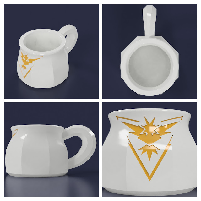 This is a significantly better balanced and better looking piece. It looks more consistent and coherent. You'll notice that since I wasn't hollowing near the handle attachment, I could just hollow the mug body itself and let those interior edges of the center of the barrel shape stand alone as angular, as well as allow that bottom chamfer to define a little chamfer on the inside of the mug container. The flow from that induced taper at the top looks a lot more inviting.
I couldn't have got here without the previous failure. Without the opportunity to fail at a process, you can't learn how to succeed.
Let's look at what this piece looks like.

This is designed as a 12-ounce mug, and I put it together with a circular base plane which lofted to an octagonal midplane, and then a circular top plane which was slightly smaller than the base. I adjusted the chamfer at the bottom for a nice 4 mm, filleted the top a couple of millimeters on each side for easier sipping, and the main shape of that body really pleases me. It's a nice, solid piece.
The handle is actually decent. 6 mm circle profiles at the top and the bottom thicken into a 9 mm flat circle in the center. It occurred to me once I began to study this that having the handle attached purely horizontally is not ideal in terms of strength. Because of the forces and the torques that happen when you lift a mug, that's relatively weak. It could be made much stronger by simply angling the connection such that more material goes along the line of stress. Will this handle work? Absolutely. Can I do better? I believe so.
The position of the badge is simply wrong horizontally, but it has the right size and aspect for the proportions of this mug. It's bold, it's exciting, and it definitely manifests affiliation with the Team. That is a good thing to have. That needs to be maintained.
Deconstruct the Bad
New video by Alexander Williams
Shapeways charges for glazed porcelain by the square centimeter of surface area, not by the cubic centimeter of volume as they do for the rest of their materials. That really, really hurts for things like mugs and cups, because the internal surface has to be done, has to exist, has to be glazed properly, and by necessity drives up the cost. How much does it drive up the cost?
That mug costs $75.Pokemon Pokeball Mug by SquidLord on Shapeways
Pokemon Pokeball Mug (G5UG4B469) by SquidLord on Shapeways. Learn more before you buy, or discover other cool products in Dining.
I will tell you now that the markup on it that would go into my pocket would probably not take me out to buy dinner at Wendy's (which is a relatively cheap hamburger joint in my part of the world, just in case you're not in my part of the world).
That's a lot of money. One of the things that ordering bespoke manufactured items with a lot of physical labor involved has is a high cost. There's really no way around it. In this case, they are taking my design, creating a mold from that design, pouring ceramics, managing it while it cools, then glazing it and re-firing it. There is a ton of physical labor involved by human beings in making a ceramic mug from a one-off design. That is why it costs $75, but because it costs $75 I don't actually expect a lot of sales. It is by strict definition a luxury item. If there's any way that I can reduce the cost of manufacturing, I need to do that.
I've already covered the discussion of the handle and why I'm not exactly thrilled with it in a mechanical sense.
Make It Work
So here I have a list of things I really like about the work and a list of things that I really don't like about the work. This work is failed. While I could go in and just adjust the position of the badge, that's just a symptom of the fact that the piece is a whole doesn't really reflect the design that I want people to experience.This is where art and engineering part ways, and where my mind becomes bifurcated because I have always have thought (and still think) of myself as an engineer first and foremost, whether that be when I was mixing music, making music, working on surface textures, designing games, running games – at heart I think of myself as pursuing a scientific ideal and moving only toward the question of "does this work?" And as a mug, that design clearly sufficiently works. It would hold liquid and pour it into your mouth when you tilt it up. But from an artistic point of view, this is clearly not sufficient. The badge is clearly a kludge in terms of what it does in the overall shape of the mug. The handle isn't very interesting and is mechanically slightly questionable. The overall shape of the piece is wonderful, but everything that's not the overall shape of the body takes away from it. And from both an art and engineering point of view, a price point that is too high is disappointing.
So what were my options?
I wanted to keep the overall shape of the mug. I love it. It's both organic and angular. It pleases me.
The handle needed to be redone from scratch, but I could keep what I learned from playing with lofts and recognize that if the loft starts from off the surface of the mug, I can use an extrusion "to surface" in order for the handle to come into contact with the main body and no further. That means no interpenetration and that I could hollow the body for the liquid receptacle without having to worry about whether the handle provides too complex of volume.
The badge was in a good place, but it was poorly done. Having tinkered about with using extrusions on the handle in order to press directly against the surface, I realized that I could do something similar with the badge – I could extrude to the surface and then move the whole badge a millimeter further into the surface along the line of extrusion, then use that as a cutting tool to remove material from the mug body. That would leave a 1 mm incised outline beneath the surface of the mug which would look gorgeous, be perfectly proportioned along the entirety of that front arc, and not notably increase the mass in front of the handle for drinking.
Some new ideas needed to come in at this point.
One of them came from looking at pictures of coffee mugs and other mugs online, which is something you should do whenever you're working on any kind of project that has a design element. Looking at other people's work and actually trying to understand it will help you understand your own. One of the things that leaped out at me as a design consideration that I hadn't really integrated was that a slightly sloping lip under the edge made for a much more comfortable sipping mug. While you certainly can drink from a straight-sided mug, just that little bit of extra curvature is both attractive and functional. I achieved that by creating another offset plane below the top plane and adding another circular diameter slightly less than the top, which I then inserted into the loft which created the main body of the mug. That gave the entire top this much more organic sloping to the outside which I find extremely pleasing.
The other new idea was to go from a 12-ounce mug to an 8-ounce mug, moving slightly away from the traditional "coffee mug" size and shape and more toward an "espresso mug." That makes a lot of things more straightforward in terms of construction.
Not the least of which being that it reduces the cost of manufacture by roughly $20. That's more than just a little change.
The new handle focused a lot more on connecting upward sweeps to the main body of the mug, increasing the amount of material along the axis of force and making me feel a little more comfortable with its solidity. I couldn't resist a little whimsy along the way, however, so the profiles at the top and bottom are hexagons while the profile in the middle is an octagon, requiring two of the vertices to split to match up with the eight vertices in the middle and then rejoin, creating this visual effect that looks as if the handle is twisting without it actually doing so. That's just a strange little bit of geometry for my own amusement
After all these changes, what are we actually looking at?

I couldn't have got here without the previous failure. Without the opportunity to fail at a process, you can't learn how to succeed.
Finale
New video by Alexander Williams
Pokemon Go Team Instinct Mug (8oz) by SquidLord on Shapeways
Pokemon Go Team Instinct Mug (8oz) (2D6HHKUQC) by SquidLord on Shapeways. Learn more before you buy, or discover other cool products in Dining.
Comments